Data
We captured all tweets containing a set of keywords, both in the body of the text and hashtags, from the date of commencement of the project. Since retweets also captured some of these are before the start of the catches of tweets date issued.
To fix notation throughout this text, consider a typical tweet:
(pepito) This is a test tweet tofulanito, you should see this page http://www.myhome.com. Look at it before the #finaldecopa
- pepito: Issuer (single compulsory)
- fulanito: Receiver (may be several or none)
- "This is a tweet ... " Message Body
- http://www.myhome.com: Link
- #finaldecopa: Hashtag (some or none)
While until recently it was limited to regular hashtags when search and statistics, is now policy to include the text in twitter trend studies. We have followed this line and consider both hashtags like apparitions in the text without distinction.
Back to top
Statistics tab
The list of keywords was initially set to a group determined by direct inspection of social networks and the Internet. From this initial set, and after the capture of tens of thousands of tweets, new keywords and hashtags to appear frequently they sought and included in the list of tracking, performing it again retrospectively from the date set. This tracking past dates can be free only in a week.
Capture and storage procedure
Given the list of keywords, we capture all tweets that contain at least one word from the list. Of these tweets extract all senders and receivers to form our set of users. Their number can be seen on the previous page, and grows over time. Likewise extract all the links mentioned.
Retweets
Also captured retweets containing a keyword, keeping creator information (first sender) the tweet and the total number of times it has been retweeted.
Statistics
They can be traced listings keywords, number of tweets, etc ...
First filters
Automenciones:
A common practice is to create noise to generate tweets where the issuer is quoted himself. We have removed the references made by an issuer itself, if we maintain the rest of mentions if any.
Collateral appearances
The selected keywords are used in other contexts quite different. An example of the singer "Lana del Rey", with millions of followers, is also frequently named as "Queen ".
Another case is the opposition movement in Venezuela, which often speak of "dictatorship ".
A purely statistical analysis gives no clues and tools to filter at this level. We will see that network analysis can understand, visualize and ultimately eliminate these lines of opinion.
General citations
There are users who appear because of its general nature, such as youtube , as there are numerous references to videos in tweets.
Back to top
Plots tab
The temporal evolution of hashtags and mentions shown.
If you select "hashtags ALL, ALL User " generates a graph where the total periods hashtags captured in X hours appears. When selecting a particular hashtag only the number of occurrences of that particular hashtag appears in a tweet of any issuer.
If you select a specific hashtag, and a particular transmitter, the number of occurrences of that hashtag issued by the selected user is displayed.
They may overlap several graphs to compare the activity.
Back to top
Heat Map tab
We can extract information from where tweets have been issued, to position them on a map and study their geographical distribution.
There are two ways geoposicionar a tweet
- Algunos tweets contienen información de la geoposición en el momento de su creación.
- Si no disponemos de la información del tweet concreto, usamos la información de ubicación del usuario de su registro en twitter.
The percentage of tweets that can geoposicionarse by any of the above two points is around 7.2 % (On the 18th, a total of 189 336 over 2,635,015).
Once the information, we can draw on the map the point where it was issued.
When there are many overlapping tweets, with a color code we envision a correspondence with the density thereof.
You can view the geo of all tweets, or select those that contain a certain keyword.
Back to top
Communities tab
Here we build the network of relationships between all those involved in the movement associated with the abdication, on twitter.
This network can be seen from many points of view, as befits a rich relationships structure, allowing a thorough study of the whole, from the point of view of its collaborative properties, beyond the individual properties, as shown in the statistics. Thus here we worry about questions like:
- What people are the most important on the Web?
- And the most authoritative?
- What groups are formed? What are the most impact?
- What groups or individuals are isolated?
- Who should I influence to reach the entire Web?
- Etc.
Relations node
To map the two key issues are:
- Set of nodes to represent.
- What we establish relations between them.
Node set
- Most Popular N: In this case we select the N users who have received more than N entries in the total set of tweets. These maps contain the most frequently cited as a people, the more "sound ".
- Mencioners user: For example if you select "Users of the Country " in this map all users in a tweet issued by them, have mentioned to El País is.
Relations
Once attached the set of users, now we must say as are the relationships between them. In this case, we say that a user is related to another if mentioned at some tweet.
Suppose a tweet like this:
(@pepito) Estoy muy interesado en el tema de la #abdicacion y lo que dicen en la @casareal y lo que comentan en @el_pais
The emiter is @pepito and he mentions to @casareal and to @el_pais.
Then we create a relationship between these two users, which aims topepito tocasareal andpepito toel_pais. That is, would the following diagram:
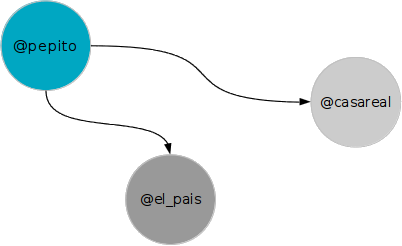
After establishing the relationship must set their intensity. For example it is not the same as mentioned pepito casareal once and El País 100; in this case the ratio should be closer to El Pais that the casareal, and therefore it is reasonable that appear closer to the former than the latter.
But we can also use other criteria such as the number of retweets tweet object of mention. For example if pepito only mentioned once the casareal, but the tweet has a great success and retweetea thousand times, should appear closer together than other relationships that have not been retweeted. They are complementary visions, and both possible.
The relationships we build always the case:
Two people are related if one (issuer) quotes another (receiver). The relationship is directed from sender to receiver, and the strength of the union is proportional to the total number of mentions.
We can build different maps according to the intensity assigned to these relationships:
- Map references: Intensity of each link: total number of mentions. Usaurio size of each map: Total number of entries received.
- Map Retweets: Intensity of each link: Number of retweets of tweet in question. Size of the user on the map: Total number of retweets tweets issued by the user.
Important note:
To view the (important) difference with the map entries and degree, consider an example of a real case.
Thecasareal issued a tweet in which congratulated therealmadrid for their European Cup.
The issuer iscasareal, therealmadrid receiver.
In our view, who gets the credit always said user, not the quote, it is clear that important are quoted (otherwise, the spammers would dominate the network).
This tweet creates a relationship betweencasareal andrealmadrid.
Therealmadrid not appear in almost any tweet over our sample, as is normal.
Therefore, since no one else mentioned in the above map (mentions)realmadrid ball will be very small.
But it has happened that thecasareal tweet was retweeted nearly 2,000 times, a very high number. In this map we are now building this merit for being retweeted so often lies with therealmadrid, which then appear larger. As a vehicle for dissemination of information, it has been really important. Another thing is that this network is not relevant for the flow of information node. This will be reflected in the map of centrality, where again his size will be negligible, as we shall see later.
Identification of communities:
On this map, we can identify those particular communities and similar groups within it, which are distinct from the rest. This is done based on well known mathematical algorithms. To visualize better, paint each community with a different color (if there are many communities, some color may be repeated, of course)
For example in such a network,
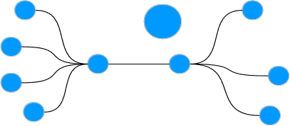
the system recognizes and colors these three communities.
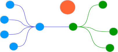
For large systems the situation is much more complex, but can be carried out with the help of a few computers.
Precise algorithms exist that identify the groups that collaborate more internally between them with the outside groups that can be considered as more communities formed by people related to each other. These communities have been identified in the maps by assigning one color to the members of a community.
Clustered maps
For further simplification we can draw only identifed communities; ie each ball is now an entire community with a user mombre corespondiente com more weight within that community. There is a relationship between two communities if there is between one of its members.
Again on this map can identify Communities and colorize related: Attention now the communities of the same color are actually "communities of communities " For the network example above, the map would be clustered:
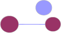
Note how the system has been initially identified three communities, therefore there are three balls, then identify two of them in turn form a community of communities, and has painted the same color. The ball isolated is itself an isolated community.
Centrality maps
In previous maps the size of each user is proportional to the number of mentions or retweets. But networks allow us to go much further.
Once constructed the map of mentions, we can ask what users perform a central role, in the sense that they are important to unite groups, catalyze opinions, spread information.
This general idea is specified as follows. Given the above map, take two nodes at random and calculate the shortest way to go from one to the other way, understanding that the length of each link is the inverse of its intensity: a more intense way shorter (users cited more ). We have so for each pair of users the shortest path that connects them (geodesic).
Take a concrete geodetic and aim each node through which it passes. We all roads, and add to each node the number of times we've passed it. This number is what we call centrality.
We can draw the map above, but now the size of each node proportional to ucentralidad do. Nodes that serve as binders of groups have a high centrality, but have a degree (number of citations) low. And peripheral nodes have low although they have high degree centrality.
Here we can see that nodes with large degree on the map, being peripheral, appear very small. They are spurious nodes, false, but automatically detected and based on precise and well-defined criteria.
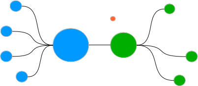
Take an example; suppose the network level, ie mentions is as follows:
We identify the communities, and we color, obtaining then
Now we calculate the centrality and proportional to it, with the same colors and the same position size.
 Back to top